Just a few sums concerning climate and climate change. I intent to extend the topics on this page to show my own calculations.
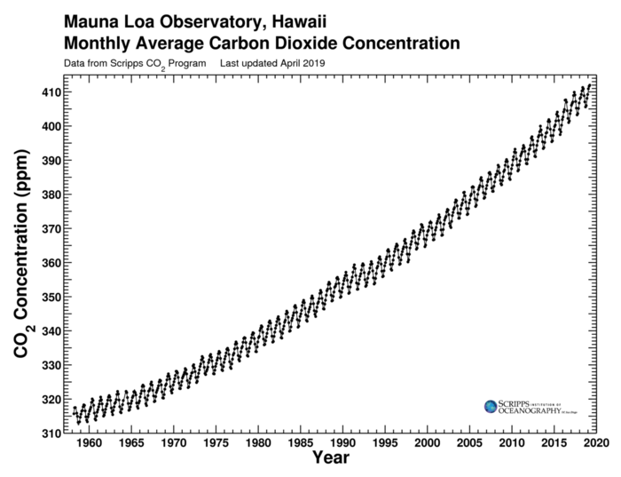
The Keeling Curve is a graph of the atmospheric carbon dioxide (CO2) concentration at the Mauna Loa Observatory in Hawaii since 1958. The NASA document Modeling the Keeling Curve with Excel describes fitting the curve to a mathematical formula. There is an annual sinusoidal component, caused by seasonal absorption of CO2 by vegetation, which is superimposed over a polynomial curve. The document uses data from January 1982 to January 2009 from spacemath.gsfc.nasa.gov/data/KeelingData.xls.
Two polynomial curves are suggested: one quadratic and one cubic. The quadratic equation is:
$$F1(t) = 3.5 \sin (6.24 t - 0.5) + (0.0158 t^2 + 1.27 t + 342)$$
and the cubic equation is
$$F2(t) = 3.5 \sin (6.24 t - 0.5) + (0.0012 t^3 -0.031 t^2 + 1.75 t + 341)$$
where $t$ is in years since 1982. (I think that the $6.24$ is supposed to be an approximation of the angular frequency of the sinousoidal component, which should be $\tau$ (or $2\pi$), which is actually $6.2831853...$. Also, since calendar years are used, the frequency should be adjusted for leap years.)
However, the most complete data for the Keeling Curve is from the Scripps CO2 Program dataset from the Scripps Institute itself, which can be downloaded as a CSV file from monthly_in_situ_co2_mlo.csv.
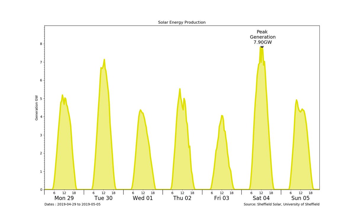
The amount of electricity generated by solar PV arrays depends on the elevation of the Sun, so it varies through the day. The graph of the generated electricity is therefore sinusoidal with a period of 24 hours. But no electricity is generated when the Sun is below the horizon (negative elevation), so the graph is similar to a rectified alternate current, and is actually a series of disjoint bumps.
Furthermore, because of the inclination of the Earth's axis to its orbit around the Sun and the orbit's eccentricity, the elevation varies throughout the year.
It is higher in the summer and lower in the winter.
This is known as the Equation of Time
. See also Solar irradiance.
Note: Is this true? Equation of Time refers to sundials, not necessarily elevation.
This should add two(?) further sinusoidal variations to the generation graph, with periods of one solar year (365.242 days).The electrical generation data from solar photovoltaic (PV) systems is captured by the
Sheffield Solar project
at the University of Sheffield.
That page currently records the installed capacity of solar PV as just over 13 GWp,
where GWp means gigawatts peak
.
This is defined as the maximum power generated under optimum conditions
(no clouds, sun directly overhead at 90 degrees to panels, on the longest day of the year).
The Sheffield site also records a value for the total effective
capacity,
which allows for some degradation of the equipment.
This is currently 12.62 GWp.
The actual delivered electrical power, in GWe (gigawatts electric
), is considerably less than this.
For instance, the peak output in the chart above is only 7.90 GWe.
Most climate-change discussions discuss the concentration of CO2 in parts per million (ppm). I think that this is a fairly misleading concept for two reasons. First, because parts per million seems such a tiny amount. Second, because carbon dioxide is a seemingly innocuous chemical of great familiarity.
Carbon dioxide is non-toxic and is part of the food chain.
It is the raising agent for bread and cake.
It provides the fizz for champagne, prosecco, beer, and soda.
It is used in fire extinguishers and, as dry ice
, in theatrical cloud-generating special effects.
It is absorbed by plants in the photosynthesis process to produce sugar and oxygen, so is commonly described as plant food
.
How then can it be dangerous?
I think that the danger of CO2 is being mis-sold as a choking pollutant, like sulfur dioxide, oxides of nitrogen, and carbon monoxide. But the concentration of CO2 required to induce suffocation is hundreds of times the concentration that causes global warming through the greenhouse effect. A concentration of 3% is required to produce mental impairment, and a concentration of 10% to induce asphyxiation and death. 3% concentration is that same as 30,000 ppm, far in excess of the current 415 ppm.
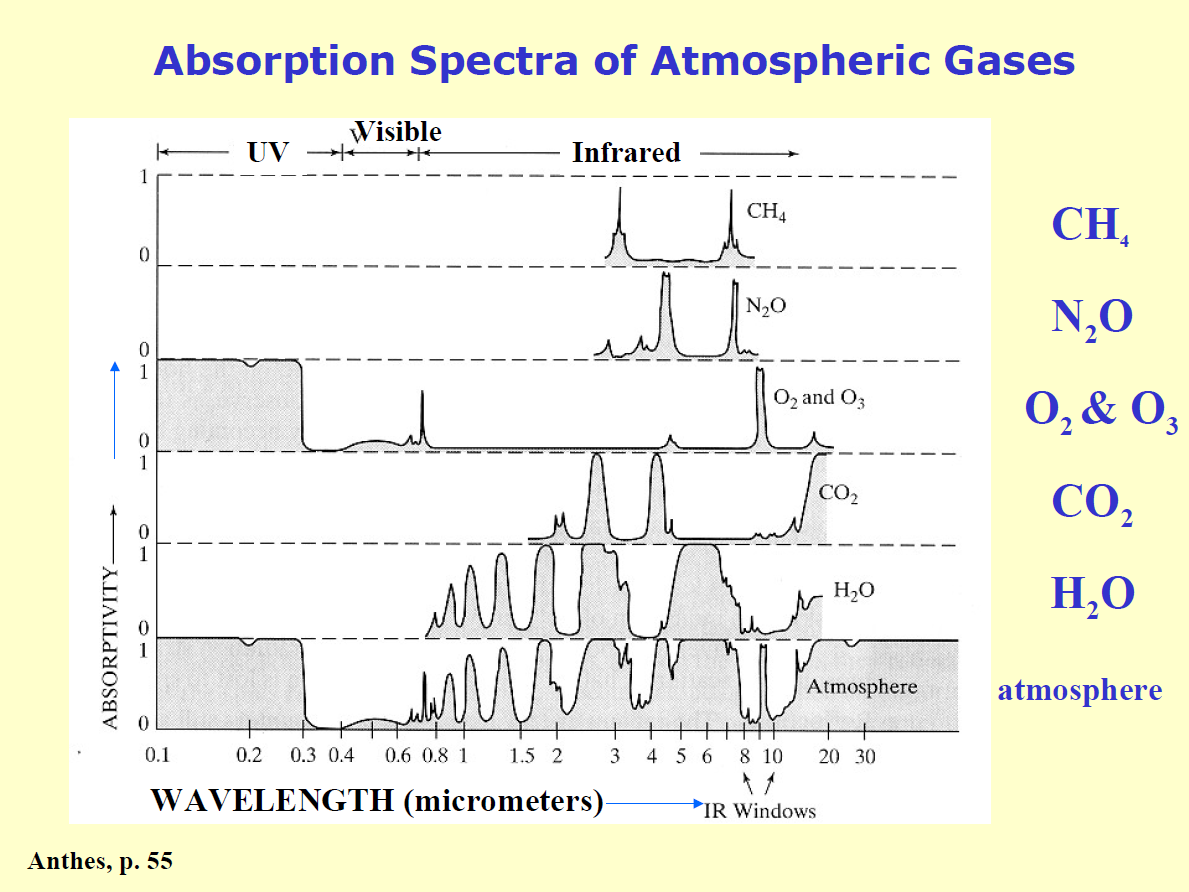
A more useful measure of the danger of carbon dioxide would be the atmospheric opacity of CO2, which is a measure of how much heat (as infra-red radiation) is reflected back from the atmosphere due to CO2 and other greenhouse gases.
The chart shows the absorption of a number of gases, but not the overall opacity related to concentration.